This is my papa. I'm trying to portray a sense of despair or sorrow, even though that's the opposite of his personality. It's tough to create a portrait without using the face. I think this one did an okay job with that, and it was the class favorite. I do realize that it's edited so that the skin tone of his hands look like a corpse, but I wanted to tint it so that the feeling of sorrow and despair come from the photo. I love the focus in this, it just delights me. And the light is lovely. But I do have other favorites.
Here is yet another of my pa. This is just hilarious to me. He is a diet coke addict, just like some middle aged mothers are, so this photo just portrays his perfectly. (not really. that would be kinda sad) Even his expression though is so Dad. I love the focus in this as well. The light is pleasing until that distracting blown out shirt. Sigh. Sorry. I like how there is no unnecessary information, just his facial expression and his baby bottle. Maybe a little bit more hair would improve it a bit. But I still love this photo.

Here is my darling sister Kara. Doesn't she make you sick? She drives me nuts with jealousy. She is my best model. Although this wasn't an image that everyone liked, I just had to post it because it portrays Kara. Always happy and positive and smiling. The greatest example to me. Ah she is DARLING. love this girl.
Here is one that people liked. They thought the others were cliche, while I thought they were just good portraits. I like her eye contact and her position in the frame-there is no useless information. But anyway, my classmates liked this one. I like it as well, just maybe not as much. This portrays Kara very well; it shows her innocence and sweetness and a little bit of her shy side. She is ridiculously adorable isn't she.. I know it. Love my seeester. Wish her knee wasn't blown out. I want her beauty marks.
One more of this girl. I don't love this one, but I don't hate it. And Mr. Meyers likes it. so. I just have a hard time accepting portraits without eye contact. Slade brought me up with that mindset, and it's tough to change. This one is okay, but I wish I either got closer on her face, cutting out unnecessary info, or got further away so I wouldn't cut off her hair or the top of her head. But the light and focus isn't bad, and her expression is simply content, and hard not to like. More of Kara coming I guarantee. [she is a stunning model]
I know this is cliche, this isn't for the assignment. It's supposed to be cliche- this is Kim's missionary picture! I had to throw it in here so you can all see how gorgeous she is. I MISS HER. She's been gone 15 weeks exactly, serving the Freiburg, Germany:) Sister Rasmussen is the greatest and I want her home, but I'm so happy she is where she is. follow the blog I made for her of her emails: sisterkimberlyrasmussen.blogspot.com {beware, she writes novels}

Here comes the crowd pleaser.
Now. I don't love this. Topher {my broha} loves it, and wanted it as his album cover. I just think it's so cliche, and it's terrible technically. It's actually alright as I look at it more, I like his out of focus eye contact. But. The background is completely blown out, and it looks like I photoshopped his right ear. {I certainly did nothing of the sort} but I must admit it's pleasing to look at.
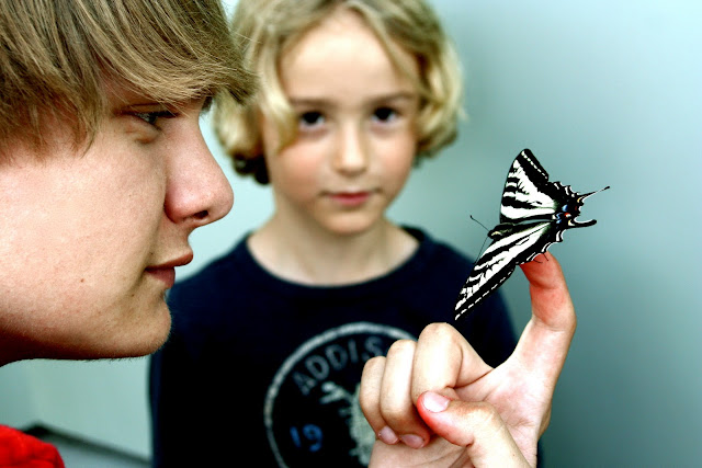
I had to put this up. I feel it's very under appreciated. No one liked it very much, but I just think the composition is brilliant! That sounds cocky. But I am very fond of this composition. Both eyes are at the exact same level, while toph is in focus not looking and the boy is not in focus, with perfect eye contact. I just love it. Underrated.
another class favorite. I like this too, although it doesn't really make sense. This is in front of the coolest house in the world. I'd show you some of it, but I'm not allowed to post them on the internet. That's how cool it is. But there are spotlights lining the wall and we were just playing around with shadows and slow shutter speeds, when I took this with a flash, regularly. I love how it turned out. The grass and the green window are great because they're a perfect border. and Toaster's body position is just delightful! Isn't that cool to look at? My classmates love it-- I think it's better than alright.
Last one of my family.. for now. Sorry. that was the famdamily session. Although I missed my mama. She hates having her picture taken. shame. Anyway, I like this photo. That, in my mind, is a portrait. Not too much useless info, but not so close I suffocate. His expression is priceless; a sense of purpose. And contentment, and determination. The light was kinda harsh, but it looks pretty good! Like this image.
Okay there's the family, but there is much more to come! not only more portraits, but ctiyscapes and interiors and landscape.. wahoooo stay tuned!


